The most important (but probably the least obvious) change is the inclusion of links to the most popular social networking sites on each list – found on both the list, itself, and the front page. Hopefully, you will all take advantage of these links to share your favorite lists. This is useful in two ways – it lets all of your friends know about Listverse, and it gives you a reference to your favorite lists on facebook, twitter and the like. You will also find links on the sidebar that show you how many subscribers we have on the various networks, and that take you to our pages offsite. These links open in a new window.
The list submissions form has been completely redesigned and rewritten to make the terms and conditions clearer, and to process the submissions in a faster and more seamless manner. While this won’t affect most of you, for those who do send in lists from time to time, we hope it makes things easier for you. Also, when you send us a list you now get a full copy of the text you sent us in an email, which will help you to keep archives of your contributions.
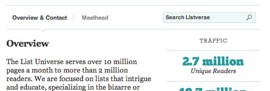
The about page now has more information about the site as well as information on our admins. This should satisfy everyone’s curiosity I hope. The page also provides a clearer link back to us via email and some interesting statistics and demographics about our readers.
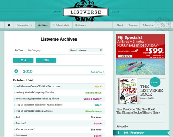
One of the most common complaints about the old site was difficulty in navigating the archives. We have finally made it easier to find your way around the lists by letting you view by category or date. We have also incorporated category colors into the site (as well as putting a greater emphasis on categories) to make the information here more obvious at a glance.
Alas, this is one area that has not changed – at present all mobile viewers are still seeing us with the same interface as before. But, the good news is that work is about to begin on Listverse II, phase 2 – the mobile redesign. We will be bringing a similar interface, but obviously much more streamlined, for the smaller screens. If you have any features from the main site that you absolutely can’t live without on your mobile device, let us know in the comments so we don’t exclude functionality you want.
Despite a complete visual overhaul by our very talented designer, Zack Sultan, we believe we have managed to retain the functionality you are all used to, and have kept things as close to their original position as possible, to make the transition an easy one. There may be a few moments of “where has that gone” but we can assure you – if you had the functionality before, you still have it – you just need to look closer. Read More: Twitter Facebook YouTube Instagram


